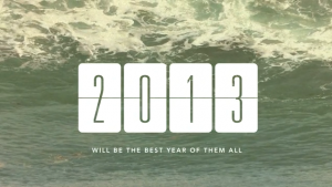
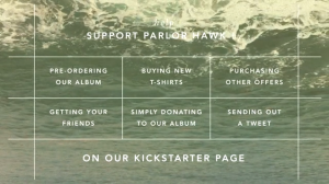
 Parlor Hawk’s Kickstarter project to fund their second record illustrates what not to do with your video (don’t forget to show your human side!), and gives a great example of what a graphic based description area can do for your project by using the time tested practices of selling on the internet.
![]()
View Parlor Hawk’s Music Kickstarter
VIDEO (2 min 05 secs)
Zero voice and zero face makes for a boring-ass video.
This video is a great lesson in the power of personality, eye contact, and human interaction. Parlor Hawk only used graphics and background music to make their video which left out the ever-so-important personal side of connecting to your fans.

Notice how it seems to drag on despite only being two minutes long? Our brains can process a message much easier by combining visuals with spoken words. You can turbo charge that communication by adding the eye contact and body language that is afforded by talking to the camera instead of trying to remain mysterious.
Watch this Kickstarter video by Foxtails Brigade. It’s another video that doesn’t feature the typical sitting in front of the camera style video. Instead it’s a stop motion style video with a narrator and a visual representation of the person talking. They get away with not having to sit in front of the camera, but the personality and human touch still comes through.
Take note on the difference in tone, the clarity of the message, and the feeling you have when the video is done. I had an empty, uninspired feeling after watching Parlor Hawk’s video, but the Foxtails video gave me a light, warm, inspired feeling comparatively.
PROJECT DESCRIPTION
No text. Only graphics.
This extreme use of graphics is original, attention getting and very effective. I like how the scrolling section at the top tells their story and includes a very clear call to action, but the big lesson is in how they provide a well laid out representation of the products that they’re offering in their packages.
The graphic of the shirt, known as a mock up, is the easiest way to grasp this concept. Can you see how showing a picture of the shirt actually leads to far more people buying the shirt package?

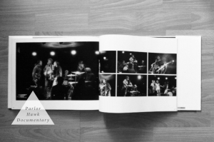
Imagine how effective it must be, then, to show a graphic of the documentary, posters, album art, stickers, and even a graphic representation of the download. It makes these things tangible and valuable.
Would you buy ANYTHING on Amazon.com that you couldn’t see a picture of?
THE TAKEAWAY
These are two extreme examples that I hope will give you ideas and inspiration for your music Kickstarter project. This video isn’t “wrong” it just goes to one extreme which helps us see how lack of human interaction can effect the success or even just the tone or nature of your project. Only you know the vibe you’re trying to put out.
Many music Kickstarter projects just have a gob of text in the description, many of those are still successful, but when we look at what’s been accepted as best practices for selling things on the internet, we see that using images to visually represent products is far more effective that just describing a product with text.
Well it worked so suck it.
andrew, it’s true, they did fund! and it goes to show that you don’t have to necessarily nail each and every aspect of a campaign to fund. i suspect that Parlor Hawk absolutely nailed the critical step of engaging their inner and intermediate circle on a personal level. but can’t be sure about that.
If an expert tells you your doing something wrong in the arts find another expert. Parlor Hawk exceeded their goal with these videos and graphics.
Continually remind yourself that absolutely nothing in this world is one sided, and you will undoubtedly come out on top. Worked for Parlor Hawk obviously, seems their fans reacted well too it.
Furthermore don’t you get tired of so many cookie cutter kickstarter videos? It’s all the same, people asking for money. There’s nothing graceful about it no matter how you look at it.
Here’s to another unsuccessful kickstarter success!