 One great thing about working on your first full-length album is that you haven’t had time to forget how to connect with fans! Maybe a more accurate statement is that the number of fans is still on a scale that more easily facilitates personal connection. Either way, the Bischoffs accomplish this personal connection very well in their Kickstarter project in two different ways.
![]()
View The Bischoff’s Music Kickstarter
VIDEO (2 min 00 secs)
Don’t try to be something you aren’t
Coming across as sincere in the video can often be tricky. The Bischoffs admit this but found an effective way to overcome that obstacle.
David Heatley of The Bischoffs: It’s so hard to look at the camera and ask people for money. That’s why we included so many failed moments of trying to do it. We just wanted to be real about it.
The band members are candid and effective as they look directly into the camera and talk to the viewer. Yes, they could have redone a few takes to remove instances of looking away from the camera but, regardless, their sincerity is accurately conveyed.
Roll the camera to capture spontaneity
My favorite parts of this video are the ones that really give me a glimpse into the band ~ the spontaneous takes. Obviously, the fellas chose to roll the camera as they discussed their Kickstarter project, then edited the footage later to include what they needed. This works well for them.
In addition, the studio footage montage of the band is cool in that it sounds like David, the singer, was just goofing off and that it ties together with the name gaffe shown immediately beforehand.
And I love the singing of the alma mater song!
Project Description
The letter-style is very conversational
The Bischoffs make nice use of the conversational, letter format for the project description. The opening salutation alone begins a personal interaction. Dear Dear Friends of the Bischoffs… The opening paragraph connects the very existence of the band back to the fans by mentioning what the fans have done to help get the band to where it is. Very nice.
The remainder of the description conveys what it needs to in terms of budget. They could, however, improve their… you guessed it… Call To Action! If you are writing your project description right now, do not leave this vague. Instead of semi-meaningful terms like here’s where you come in and with a boost from all of you, just flat out leave no doubt and say, “please support this project today by choosing a rewards package and pledging your support.” Plain, simple, no doubt.
Use graphics (especially when you have them!)
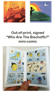
The Bischoffs have some excellent graphics – but not in their project description! They actually tooled their band webpage for their Kickstarter project. If you visit it, you will notice high quality pictures of their T-shirts, mini-comics, and other band related art. These would be well-placed in the project description. Don’t forget, images help increase readability and conversion rate!
The Takeaway
The Bischoffs video is a good example of how to use spontaneity and personality to make a personal connection. They follow this up with a project description that is yet another good example of reaching out for the personal communication. This band understands the need for such outreach. David sums it up well…
David: We actually don’t have a mailing list—we should, but we don’t… But I’ve also gone through my entire Gmail address book and have sent a personalized note to dozens and dozens of people… It’s been a really good strategy and well worth the extra time to personalize each letter…
I’m realizing that fundraising is a grind. It’s a job. People don’t just magically hand you money. You work for it—harder than you thought you’d have to. It’s about being connected and continually putting yourself out there and asking over and over again.

Leave a Reply