I have an eye for design and presentation. It’s hard for me to let go of putting the look and feel of a project at the very top of my priority list, but I see over and over that beauty and artfulness is not even close to being a priority when it comes to hitting your goal amount.
This fact really pisses me off but that doesn’t change the fact that beauty, artfulness, or presentation is a choice, not a requirement.
This Video is Lackluster, but Who Cares?
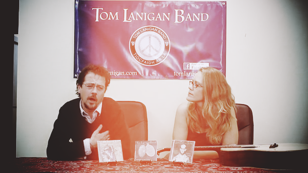
When musicians look at this video, a bunch of them are thinking “man, look at that cheezy banner behind them. Is that their arts and crafts fair booth? Our Kickstarter video is gonna ROCK compared to THIS.”
To this I answer: Just aim to make your video congruent with your personality and your brand. The viewer is watching it to get your story and your message, everything else is just a distraction.
If your story, identity, and your message is connected to artfulness, awesome design, and beautiful video production, then great. Go for it. But just like when you record your album, make sure your production doesn’t get in the way of the message.
In short, get out of your own way. Take those 12 pages of production notes and figure out how to do the same thing with two pages. Simplify, get to the point, then season with personality and aesthetics.
The Proof Is In The Numbers
Tom and Jenn (the other member of the Tom Lanigan Band) got 68 people to back their project for a $103 average pledge per backer. This is phenomenal.
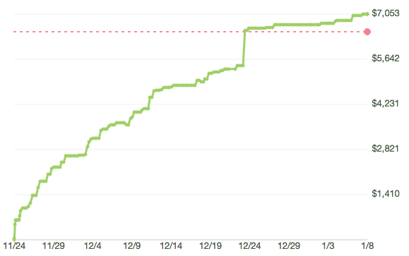
Take a look at the graph below (courtesy of now-defunct CanHeKick.it). Notice how you can quickly forget about your massive production plans when you correlate this graph with Tom Lanigan’s simple-ass video (which probably took them an hour to put together)?

The Rewards Are Just As Simple As The Video
This project was framed as a fundraiser, not a pre-order, so the prices were jacked way up for maximum effect.
The total amount pledged when adding up the rewards is $3440 which means that the project received $3613 as overpledges or pledges that were given without selecting a reward. This further solidifies the benefits of framing your project as a fundraiser.
People simply want to help you more than they want your rewards. Aahh the power of personal connection.
Here’s the reward breakdown:
- $10 – “eternal gratitude” (3 backers – $30)
- $20 – Digital (18 backers – $360)
- $50 – Signed CD (12 backers – $600)
- $75 – Signed CD + existing CD (4 backers – $300)
- $100 – Name in album credits (11 backers – $1100)
- $150 – Vocal or Guitar Lesson via Skype (7 backers – $1,050)
TOTAL: $3440
We consistently find that projects with an older demographic (40+) can really shine with fundraising pricing like I’ve listed above.
I’d suspect it’s for two reasons: These project creators have a lifetime of relationships (more so than younger people) and those personal connections are usually with older, more financially stable potential backers.
But even if we’re not looking at the age demographic, the psychology at play here, when considering what you get in return for pledging these amounts, is that people are pledging at the level of support they want to show to the project creator.
In other words, they’re not pledging for a product, they’re pledging almost exclusively to help their friend out, which is why we see here that over half the funds raised were from people who didn’t even choose a reward!
The Takeaway
Don’t over think your project. If you’re a regular reader of 100 Music Kickstarters to Learn From, you now know that it’s more about giving your potential backers what they want than it is about wowing people with your video production skills.
Potential backers want an easy, as close to thoughtless way to show their support. When you clobber people with a pile of information, they get overloaded and can decide not to make a decision at all.
Ease of decision making will trump presentation every time as long as you have the pre-existing personal connections!

Leave a Reply